skip to main |
skip to sidebar
 Again, this picture has an unknow artist. However i choose to use it anyways because it is different from all the other images I have used up to now. Before this abstract drawing, I always used a photograph to illustrate the theme of our projects. However, this abstract drawing is using claustrophobia very clearly. The man (who has abstract looking shapes, like his eyes) is squished into a square, and looks like it cannot even breath. On top of that, he looks rather afraid, which you can see by his hands and mouth. Trying to get away from something he can't. I really like this drawing due to the use of claustrophobia.
 Mircea Grumaz, a Romanian sports journalist, took this picture. He seems to be a rather paradoxical man since he does not like having a beard, yet he doesn’t like to shave either. He was born on May 17, in Maramures, Transylvania, Romania. I chose to use this picture as a claustrophobic picture because it is very dark, and even though there is a little bit of light, it looks like there is no end to that mine. And it also feels like it is all falling down for it gives us a sense of insecurity when it comes to the location. If I were to be in there, I would be very afraid, and would probably have a lot of trouble breathing properly.
 The artist of this picture is unknown however I chose it because I think this would have been an amazing picture to use for this project, and because this picture would have meant so much to my own claustrophobia I thought it would be a pity to not use it. I am incredibly scared of needles; I cannot handle someone standing close to me with one. Even less can I handle when someone else injects one in me, like doctors do. That is why iI chose this picture to be a claustrophobic picture.
 This was my last print, and it was a fast print too because I thought I was finished with the project but I wasn’t. Thankfully I wanted to print this picture as a claustrophobic picture as well, but before I thought it would not fit into the limit of pictures. This picture was the one that needed the most time. I began with the settings for the previous print. Therefore I started at 73. However, when I saw that it was too light I did what you can see on the test strip. The lowest time is on the bottom of the test strip starting at 75 seconds. From there I went up in 5 seconds. The top of the print ended at 90 seconds. As you can see on the full print compared to the test strip, the full print is still darker. That is because I didn’t think the darkest part of my test strip was dark enough, therefore I added an extra 5 seconds to the full print. This means that my full print ended up with 95 seconds, no filter and aperture 2.8 for its settings.
 This picture makes me claustrophobic because it reminds me of a forest at night, when you’re not able to see things properly. That is probably one of the things that scare me the most, not knowing what is ahead of me. Therefore, this picture shows a lot of distance, yet there is no real detail of anything. Just a bunch of bushes put together.
 This picture is of Marte. As you can see from the picture, the subject (Marte) is looking very dark, however the picture itself is not too dark, as you can see in the background as well as the subjects hair. This gave myself quite some doubt because I thought that the lighting was too dark, however the teacher thought it gave the picture a nice effect. Usually when I use pictures from the same negatives, they roughly have the same settings. For this reason, I always follow up with my settings from the picture printed before. If we look back at the settings of the previous picture I used an aperture of 2.8, no filter, and left the paper in the light for 80 seconds. Which is why I began with my test strip at that time. When the teacher and I saw directly that it was too dark, we were able to figure out how much time I needed for a full print. Because the picture was too dark at 80 seconds, however it wasn’t dark enough to not see detail, we only took 7 seconds of. Therefore, my final print ended up being at 73 seconds, with an aperture of 2.8 and no filter.
All of my friends and family in Spain live in apartments. That is something you will often find when you go to Spain, ins tead of having houses everywhere like in Holland, there will be apartments. However, to have high apartments, elevators are a major key factor. Usually, they work well, and it is not a problem, and when they work well, it isn’t scary to go in them. However, when I go to my grandfather’s house, an apartment, which was made in the 60’s, I get very scared when I enter the elevator. Usually it works well, however, sometimes it randomly stops, and I feel claustrophobic, wanting to get out and start panicking. This is what this picture resembles. As Marte is in the elevator, she is looking at the door closing, looking very frightened. Which shows claustrophobia. In the picture, you can see that her eyes are looking at the door, and they are bright open, which is a fear factor.
 The second image I printed was the one of the teacher’s daughter by the school gate. Therefore I took a picture of her daughter standing in there. This image seems to be better in focus then the last one. However it is clear the part that is most in focus is the middle part of the girls body. It was also relatively easy to find the settings for this picture since they are very similar to the ones of the last print. The settings for this image are at 80 seconds, 2.8 aperture, and no filter. As you can see, the only difference is the time I have put into the picture, but it only has a difference of 5 seconds. When finding the settings for this picture, I started off with the same ones as I had for the final print of the previous picture. So, aperture 2.8, no filter and 75 seconds. However, even though it had a good enough contrast, the picture needed a little bit more detail. Therefore I added 5 more seconds to the final print.
To me, this picture refe rs to what I consider claustrophobic because when I take the bus towards Leiden, I need to go through those doors every day. Usually, that door does not frighten me. However, when the school ID doesn’t work and you are trying to push those doors but nothing happens, I usually get a sense of insecurity inside. With the face she put on the picture, it makes the picture look better because she has a scared face. The fact that she is holding a stick is also rather effective in another way, because it maybe be what she is holding in order to defend herself. She looks like she is lost in those gates, which makes this picture so forceful.
 The first image I printed was the one in which Abbie is hiding under a table, looking at the wall where there is a shadow of a hand. When looking at the negatives, I thought it would be a very nice picture to print with the theme of claustrophobia because it seems like a terror kind of scene. When I saw this image on my negatives I thought it would turn out very well since on the negatives its contrast was very good, and it did not seem like it was out of focus. However, the teacher did tell me that it looked like it was out of focus. When I decided to print this picture anyways, I saw that the subject, Abbie, was indeed out of focus. However, one of the table legs is clearly in focus. I have been seeing that some of my pictures have only one spot in focus and the rest is not in focus, which I find rather odd, since I believe that when taking pictures, I tend to firstly focus the faces of the people, and then move into the picture’s position. This is something I will need to pay more attention to when taking future pictures. It was also very easy to print since it has the exact same settings as my negatives do. Its settings are 75 seconds, at 2.8 aperture, and no filter. This was very handy and fast for me to find.
  This picture, just like all the others for this project is supposed to have a sense of claustrophobia in it. Often when we watch a scary movie, the shadows that are shown scare us. This is the kind of feeling the picture is trying to give us. Abbie’s face is also the main key for this image because she is staring at the reflection of the hand on the wall, looking frightened. However, the shadow is therefore a very important part of this picture. The way, in which I managed to put the shadow of the hand in this picture, was by using photo shoot lamps, and having Marte put her hand in order for the shadow to occur. I personally really like this picture, because of the claustrophobic affect is has. Abbie’s face is what determines the claustrophobic effect of this picture because she is truly frightened by this shadow, which she doesn’t truly know what or who it is.


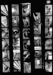
 My negatives were very easy to find, I firstly started with (as you can see in this page) the printing composition with only five pictures. To find the settings for these pictures I started off with what I usually start off. Which is at aperture 2.8, no filter, and I begin with 2 seconds, and go up in two's until reaching 10 seconds. When i saw that something was turning up, but it was way too white to see anything, I immediatly added more time. then i began at 20 seconds and went up in steps of 10 seconds till i reached 70 seconds. At that point everything turned out, however, I saw that if I added only a little bit more time to the maximum time, it would turned out better. Therefore, all of my negatives which you can see on this page are at the same settings, mainly at aperture 2.8, filter 0, and 75 seconds. I'm very happy with how they turned out because most of my pictures are in focus and their contrasts are close to excellent.
During this claustrophobia project it was relatively difficult to find things that were claustrophobic while being at school. It took a lot of thinking, when someone mentioned taking pictures of a spider; I figured I could go look for a spider. But with temperatures like these, finding a spider was almost impossible. When walking around the school, I found that it would be interesting to take pictures of things such as the elevator, which scares many people including myself when something is wrong with it. When finally getting all the pictures together, I saw my negatives turned out well. Finding the settings for the printing compositions is always what takes up most time. However my negatives didn’t seem to be grey at all, for which it makes finding settings a lot easier. Again, during this project I had finished my prints rather fast. When we started, we thought we only needed to print 3 pictures. I managed to do so in only 2 classes. However, the second last class we spent working on this project, it turned out the assignment said we needed to print 4 prints. Which I managed to finish in only one class, and start on another project (the teacher prints). Printing was not a problem for me, my images turned out well, with good settings, and I am very happy with them. However, it does seem to me as well as the teacher that my framing skills are rather bad. For which the picture is not straight on the paper. This will have to be improved over the course of this class.
 This photography was taken by George DeLoache, an American photographer, and often takes pictures of portraits. This is a very interesting picture. It covers, unlike the other images, over half of the man’s body, and is also in black and white. The lighting is very different from other pictures, because it seems like a lighting that goes vertically across his body. I think it is very interesting because the entire picture is very dark except for the middle of the picture vertically. That part has more light and more shadows, which gives a very nice effect.
 This image was taken by Carlo Schuller, a German photographer who mostly takes shots of fashionable appeal. In this black and white image, we can see the way in which this photographer has put both hair as light into action. The light is coming from her front left side, which is reflecting on her hair and part of her face, as well as part of her body. This picture was most likely taken as a modelling shot for which the photographer was able to move around with the light on at all times and take the picture with the right lightings on her and on her hair. I really do like this picture because of its ordinary look, and the natural yet posed face and look in her eyes.
 This photograph was taken by a man named Bill Schwab, who was born in 1959 in Detroit, Michigan. He is an American photographer who is well known for his emotionally charger but peaceful urban and natural landscapes. He had received a Bachelor of Fine Arts degree in 1983 from the Central Michigan University. And has shown many solo exhibitions around the whole of the United States. This image is of an Asian lady, looking into the camera. The use of light is rather peculiar in this image because it is pointing straight at the face, and the back of the image (the wall). It is interesting because only the center of her face has sharp light, the rest looks rather dark still, and is not as strongly emphasized. However, because of this different use of lighting, I think it makes it a special image, and rather interesting too.
 On the last print, I was looking at a close-up of the two girls. Sadly, it is not a very sharp close-up. It does still have some distance. This image has the same effect as the previous one with Faith’s glasses. On this picture there is also a reflection of the light, which is rather upsetting. Like I said for last picture I should have asked Faith to take her glasses off. I do however like that Renee is the only one in true focus, because that then focuses more on Renee’s hair, yet have Faith as well in order to evaluate her within the picture as well. This image didn’t need different settings than the other ones either; it also had an aperture of 2.8, and filter 0. Its test strips were started at 65 seconds, like the first print. And then I went up in 10’s until I found the right setting, mainly aperture 2.8, filter 0 and 95 seconds. Then I printed it in large size. Over all I am happy with this image, and like I said, I like that Renee is in focus and Faith is not. Like, she said herself, this image looks like the photographer wants to emphasize on Renee, and have Faith seem a background person. However the contrasts in this image are very clear.

 The use of light in this image was by using an umbrella, and we can see a slight reflection of it in her eyes, this was probably because the light intensity was too high, therefore I should be careful next time to put a softer light source. Yet for the light to be intense enough to still be able to get those shades by her neck and under her chin. This image was the second one I printed. As well as the most difficult one to find the settings for. Because I took this image from the same set of negatives, I thought that by starting on the same timing as the previous full print it should be alright. However, it turned out not to be the case. It took me a relatively long time to find the settings because I needed to go higher in time since it was too light. When I reached 145 seconds I found that that was the right setting for this image. Then I printed it on the larger paper. This picture was one taken for the assignment of an image with two subjects, for which I included both Renee and Faith. It is a pretty nice picture, however just like the previous picture, its contrast is not too outstanding, it does still contain a little bit of grey, yet it does still give it a nice effect. I am a little bit upset about the fact that Faith is wearing her glasses because that made a negative effect when it came to the lighting since you can see some of the light reflected on her glasses. However over all, I like this image, the shadows it gives off between the hair and the faces of both of the girls, as well as that shadow Faith’s sleeve creates upon her arm.
 Firstly I printed a picture of Renee by herself. This picture was representing the angle shot. I firstly put the negative in the enla
 rger, and in order to have only the important part of the picture, I had to move the enlarger up. When I did this, I thought about how the fact that I moved the enlarger upward it would affect the amount of light, and that it would have to be exposed for longer time as well. Therefore, using the same settings as for the printing compositions, except adding more time, I printed the first test strip. When I saw that this was going to be too light, I made another test strip going up in 10’s. I then directly saw the right settings for my final print. Mainly aperture 2.8, filter 0, and 65 seconds. When I got the results for this image, I printed it in the big sized paper (A2 Paper). I was not sure yet how I wanted to fit the picture in. I first did it landscape wise, however this meant there would be too much free space on the sides, therefore the image would not really look very good. So I decided to make it into a portrait. This made the image look a lot less empty for which I like it more. I think it’
 s a good image; maybe it is a little bit grey however it gives a nice effect. The shadows in this image are special too, because of the angle shot, for which the light comes from the top; she has a shadow under her chin and by her neck.
 Like I said in my diary entry, I was lucky when finding the settings to my images. I was able to recognize that the negatives were very dark, therefore, when I went into the dark room, and I started making test strips to find my the settings of these printing compositions, I knew I needed to start at a rather high time. For this reason, I started with a very open aperture (2.8) and with no filter (0) this way I took away no light from the light source, and I started with 20 seconds going up in 2’s. This test strip had worked out, and the pictures were visual, but the best time of the entire test strip was of the highest, yet I had not quite reached the time. But 32 seconds seemed to be close, so I tried a full test strip at 35 seconds. When I saw that this test strip was clear, I printed all of my negatives at those settings (A. 2.8, F. 0 and 35 secon
 ds). When I made the full print, it was rather odd to see that my images were blurry, while on the test strips they were not. I still do not understand the reason for this, since some pictures are in focus and others are not on the same test strips. On these printing compositions however, we are able to see my pictures clearly. And they all seem to be rather good, with good contrasts and regarding the topic for the project they seemed to be good too. However since during the shooting, I did not know what exactly was required for this project, I did not focus too much on these specific details, which is why it was rather hard for me to find a picture (after having shot them) of a close up. However, I did find it.
 Light metering is about measuring how much light is entering your camera when taking a picture. There are two ways of doing this: The Reflective meters measure the light that reflects off of the subject. This varies a lot because of the looks of the person, for example, if they are wearing a light shirt it will reflect a lot more light than if they are wearing a dark shirt. Within reflective meters, there exists weighted metering or spot metering. Weighted metering takes a general metering of the entire scene like it is viewed through the camera lens, yet more emphasis is placed on the central part of the image. Then there is also Spot metering focuses on a small portion of that same scene. This lets you measure the amount of contras in different portions to determine the contrast range. Then there is also another way of metering light; Incident light metering. Which measure the light that falls onto the subject. Usually done by using a small white dome on the top of the meter cell. With the incident metering, you need to stand by the subject, and point then white dome at the camera, by which the meter then measures the amount of light falling onto the location and gives you a number.
Flashes:A flash is an apparatus used in photography that directly produces a flash of artificial light at a color temperature of about 5500 K in order to help the illumination of the scene out. These flashes can be used for different reasons, for example to be able to capture a quickly moving object, or to create a different temperature light than the already given light of the area, however mostly, in order to illuminate the scenes that do not enough natural light to be able to p roperly expose the photograph. Most of the flash units found today are electronic, which have evolved from single-use flash-bulbs as well as flammable powders. In lower-end camera photography, flash units are usually built inside the camera. Whereas a higher-end camera allows for multiple flash units to be mounted through a standardized “accessory mount” bracket (often called a “hot shoe” (this is a mounting point on top of the camera in order to attach the flash unit)). Professional studio photography also uses a special way of flash light by using individual standalone units, which are connected to the camera through a flash synchronization cable, which will therefore allow the flash light to flash when the camera is shooting the picture. This will also allow having only one light-trigger to be attached to the camera, but it can inform other light-triggers and they would all flash. Nowadays, there are different kinds of flash units we can use. Often we use electronic xenon flash lamps. These contain a tube filled with xenon gas, in which electricity of high voltage is being discharged in order to generate an electrical arc which emits a short flash of light. Since 2003, most cameras that are targeted for consumer use have an electronic flash unit built in. Microflashes are also a time of flash unit; these are special, high-voltage flash units designed to give
  of a flash light with an exceptionally quick, sub-microsecond duration. These are mostly used by scientists and engineers when they want to capture a picture of a fast moving object during one of their experiments. There are also flashes especially for modeling, which do not go off at any given point, they maintain on during the entire photo shoot, which is helpful for the photographer because they are then able to know what the lighting is going to look like in each image. The use of the flashes: They are usually used indoors as the main light source when there is not enough natural light to satisfy the shutter speed. A fill flash illuminates a subject close to the camera while using an exposure long enough to capture some background detail. Another technique, is to point the light source up to, either to the ceiling, or to an umbrella which would reflect the light to the object, this is called bounce flashes (which is what we used for this project). This bouncing effect makes the image look more natural than if the light is directed directly to the object. These flashes do have problems. For example, built-in flash units often have a low intensity of the flash. Electronic flashes also have durations that are so short that the shutter speed needs to be used on focal plane shutter cameras. Finally, these flashes also create the red-eye effect. However over all, flashes are very helpful.
During this project, my class used negatives which seemed to be rather different compared to that which we used during previous projects. These negatives are not as see-through as they always used to be. At first I thought it had only happened to my negatives, which therefore could have meant that some light had gotten into the canister, which had therefore exposed the film. However, this same thing occurred to all of my class mates. Yet I was rather lucky when it came to my prints, it took me only three classes to fully print all my pictures in large size. Even though these negatives were less see through, I was still able to print the pictures well, and I did not need to use any filters. My timings were rather high, but I think this is because of the lack of light being able to pass through the negatives themselves, which therefore, even though the aperture was open; I still needed a lot of time. The high number of seconds could also have been because of how high the enlarger had to be put at. We were printing these final prints on A2 paper, which meant that the distance between the light source and the printing paper was farther too, which would mean that some of the light would get lost. Therefore, more time had to be added. But as I said, I was rather lucky, because even though my highest number was 135 seconds, there were students who had to go over 500 seconds. I was also lucky with the speed in which I was able to find my settings. Over all, I think I worked well in the dark room during this project. There was only one major problem which forced me to ask for help; when my enlarger was put at the top, I was not able to focus the image because I could not reach it. However, I got help to focus it.
 This image was taken by Chuck Kennedy, also a profesional photographer, from Amory, Mississippi. This is a very warm picture compared to the previous picture because it is using natural light, during dawn. I like the effect this gives because their body looks a lot warmer, showing that it is summer. I also like how the sea is in the background and there are a couple of buildings in the background as well because they also show the strength of the sun light.
 This image was taken by Michael Fineman, a profesional photographer from Miami, Florida. I like the way he has taken this picture, because of the use of lighting. This light, different from the previous image, is artificial light. It is obvious because it gives him a whiter color, instead of giving a warmer color. The use of lightin in this image though is interesting because of the effects it makes. Especially on the black jacket he is wearing, you can very clearly see the detailed outline of where the jacket folds. It is also nice because of the great amount of light focused on the left side of the singer's face, yet the darkness of his right side of his face.
 This image was taken by Mark Robert Halper, born in 1965 in San Francisco, California. He is living in Los Angeles, as a photographer, and is known for his striking human images in his commercial and fine art photography. He has worked with portraits, lifestyles, celebrities, architecture, still life, and fine art. The image on the left shows one of his images with architecture. I chose this image because of the use of lighting. This picture was most likely taken early in the morning since the light is coming from low, and it is a natural light. I like it because is shows clear shadows of the trees, but also because on the edge of the building you are clearly able to see where the sun is illuminating and where it is not, and the difference in lighting.

 The dress on the left is what I had chosen for the fashion of clothing. This picture turned out relatively bad lighting because it wasn't natural light. I used artificial light while taking this picture because it was late at night, and there was not enough light from outside to capture it. That is why you can see that there is a lot of light at the top of the picture, but a lot less at the bottom of the picture, so the detail is lower where it is darker. But because the picture was taken this way, i couldn't do anything about it. The print on the left shows an aperture of 2.8, with filter 2, at 16 seconds. This was also the first print in which i used a filter because it was too grey. The test strip on the right also shows how grey it looked. When i did my larger print, like i said before, i had to add a lot of time in order to get rid of the greyness. The teststrip also shows the difference is the use of grey at the lowest time in comparison to the highest time. The lowest time is at the bottom of the dress, starting at 30 seconds, going up in two's up to and including 36. Since 36 seconds was the best, my final large print was at 36 seconds, 2.8 aperture, and it had no filter.

 For accessories, i used three cellphones and one watch. The watch is hidden in the back. I find this a nice picture because of the use of three different phones and the use of focus. I like that the only thing that is truly in focus is the black phone under the other phones. Because it gives more empahsis on the detail of that phone as opposed to the other phones. This image was easy to print when I was still printing it on small paper, because it didn't look too grey as you can see on the left. The settings for this image is aperture 2.8, filter 0 and 10 seconds. But when I started working on my bigger print, like you can see on the test strip on the right, i simply increased the time to twice as much. But the picture turned out too grey. So i had to start increasing time, and eventually, the final print was at 26 seconds, without a filter and at aperture 2.8. The final print has a use of color like the smaller print does on the left, so it doesn't look very grey like the test strip does.
 This print was complicated to get it's exact point because of the intense use of shadows and lighting. This image had a significant boundary. The final small print was printed at 2.5 seconds. But when i tried it at 2 seconds, i could see he grey coming in the shoe which is black. But as i put it to 3 seconds, you couldn't distinguish between the shoe and the shadow. Therefore, this was the right timing. While printing this, i realized that i don't only need to think about focusing the image properly, or the position of the subject, but i realized that I need to be careful with the setting. As you can see on the back of the image there is a wire coming through. This is rather disturbing in an image like this. So I know that for next projects and prints i need to look at the image as a whole, not just the subject. As i said before, this image was taken at 2.5 seconds, the aperture was 2.8, and it had no filter. But our final print had to be on a large print. So i had to put the station higher to make the print higher too. This means that i also had to increase the time I was putting the paper in sunlight. The reason for this is because distance looses part of the light, so the higher the light source is, the more time you need. But when i doubled the time, from 2.5 to 5 seconds, i saw that it was still not enough time. Which must mean that I enlarged the image more than twice the size. My final print ended up being at 8 seconds, with an aperture 2.8 and no filter.

 For this project, i only needed to making printing compositions for two of my prints because I had taken my picture of the shoots before during a different project. The printing composition of that print is also on the last blog made for last project, but below it is shown again, at an aperture of 2.8, filter 0, and 2 seconds, this printing composition is shown on the right. The second printing composition you can see on the top left. Some of the images taken for that film were related to clothing, and others were related to accessories. But of this composition i ended up using only the cell phones with the watch witch was an accessory. The composition has a good use of contrast, and it is very clear. Howeve
 r some pictures are not well in focus. But it was an easy and fast process to find it's settings, which were at an aperture of 2.8 filter 0 and 8 seconds. Which is similar to the first printing composition, except for the timing, which usually depends upon how new the chemicals are that are being used.On the right, we can see the final printing composition i made for the clothing section of this project. This composition has a worst use of contrast, as we can see it's a lot darker in comparison to the other compositions, however the detail remains good. This composition was taken at a higher filter because without the filter the composition looked too grey. This composition is at aperture 2.8, filter 2, and 11 seconds.
Sunlight ShootingWhen shooting in direct sunlight, the images can end with a too high contrast, blown out highlights, lens flares, and colors that look overly saturated. There are several ways to prevent this from happening: - Move into the shade- this is usually the best while making portraits to have the subject in the spotlight, but not insert too much light into the camera.
- Make your own shade: When you are unable to move the subject, use your own shadow, or someone elses shadow, or use a different object to make a shadow.
- Use fill in Flash: therefore you give lighting to the shadows the image creates
- Use a reflector: such as a mirror to reflect back some light to the subject which is good for allowing shooting into the sun.
- Change your perspective: changing your own position may be handy to avoid direct contact with the sun.
- Use a lens hood: You can also simply use your hand, to cover your camera a little bit from the sun.
- Filters: They will cut down the light getting into your camera, and the polarizing filter cuts down the reflections.
- Pick the time of the day to shoot: Dawn and dusk are the best times to shoot since the light is not as strong as the light coming during the day from above the head.
Low-Light Shooting: Unexperienced photographers often use their flash directly when they see that there will not be enough lighting in the image without the extra support. To create a greater sense of lighting, this is very effective. However there are other techniques to make a good potograh.
- Fast film:
When using a traditional camera, you are recording light on the film. While processing the film, the image starts coming out on the negative, having formed a picture. The use of speed of the film is very important, because the lighting in the area you are shooting needs a different care than in a different area. When the conditions are dim, you want to shoot with a high speed (ISO 800). If you want to get a large amount of what is in the picture in focu, you need to close the apreture. This picture will usually take longer to shoot because it needs more time to absorb the light. Therefore it would be handy to use a tripod while taking that kind of pictures.
Taking low-light shoots falls into two categories: natural light, and artificial light.
-Natural Light: In color print film, photographers are nowadays using ISO 800 films which give them better results than the ISO 400 they used several years ago, because their images are sharper, have a better contrast, and have brighter colors.
- Fast Lens:

Fast lenses are usually of apreture 1.4, 1.8, or 2.8, which allow the more light into the camera then slower lenses do. When the light lever reaches the film increases, the shutter speed at which you can shoot also increases. Reducing the chance of a moving, or blurry pictures.
- Fill Flash:
It is usually better for the image to while shooting with a flash light, to reduce the intensity of the flash, which is possible in camera accesaries sold now. The image on the right uses fill flash.
As we use the dark room more, we start to get more experienced with it. However I keep learning new things every time. While working on this project, I have had to use a filter for my last print: the prom dress. Without the filter it was too grey. Last school year, while I was still a beginner, my ability to make good photography’s was not very skilled.  Therefore, I had to use filters often because my picture would not have enough contrast. However, that filter was different to the one I am using on my new station. Last year the filter had one wheel, but this year, it has 2 wheels. Using yellow and pink to change the filter. Depending on the combination, there will be a higher filter or a lower filter. So during this last project, I learned how to use a different kind of filter.
 This image was taken by Doug Crouch. He had been working on commercial photography for over 20 years working with clients such as Fender, Petsmart, Motorola, American West Airlines, and other magazines. This image was one posted on a magazine, and shows us a clear use of hard light. This is because the person is relatively light due to the light source which probably focused on him, whereas the background is very dark, and the left side of his is very dark too. This causes a worse effect because the details are stronger in the parts where the light is strong, but where the light is less strong, the details are very unclear. Therefore, I don't like this picture as much.
 This image was taken by Richard Blinkoff. It shows a use of soft lighting, because the entire face has more or less the same shades, however, it is clear that the light source is coming from her front, because she has a little bit of a shadow on the left side of her face, and there is a little bit of a shadow behind her. But overall, she has the same shades on her face and body. I like this picture because of the contrast in colors between the wall and her shirt, it's a good combination of colors, as well as the use of light makes her eyes stand out more.
 This picture is by Bob Greenberg. He had been an employee for many years for Microsoft. And now makes golf softwares. As of right now, he is living in Boca Raton, Florida, where he follows his love for photography. He uses a lot of hard lighting in his pictures, and usually uses fragrances for his pictures. Like on the picture on the left, you see how hard the light is. It comes from only one spot, and leaves a very big shadow. I do like this picture because of the effect the shadow has, it makes an increase in size, which gives it a special effect.

 Garden:
This picture is also very nice, however it is a shame that it looks as if the left side of the picture is more in focus than the right side. But when it comes to the contrast in this pictuer, it seems to be very good, the blacks are black and the whites are white. I personally don't only like this picture because of the quality, but also because of the content, because I think my garden is rather beautiful, with the little garden house, and all the trees. I have noticed with this image as well, that when i printed my test strip, it looks as if it is not in focus, when it really is. but the reason for this seems to be because of the lighting in the picture. I found this really interesting because it had never happened before. But when i printed the full print at a higher time making the picture a little darker, the image turned out to be in focus. So this was an interesting new discovery. The test strip was at apreture 2.8, filter 0 and 2 seconds, whereas the final print was at apreture 2.8, filter 0, and 3 seconds.

 At school:
This image looks pretty beautiful because of details in the leaves of the trees, and the shadow it gives off. This is a truly beautiful picture in black and white. Also because of the big contrast between the sky and the trees, sadly this contrast isn't as clear on the internet as it is in the real photo. This image shows clearly that it is using hard light. This hard light is however not taken from artificial light, but from the sun. It is so clear that it is hard light because of the darkness in the shadow, and the brightness in the sky. With such a great contrast. The times on this image are also a little different than on the test strip. But this time it is also drastically different from the other pictures previous to this one because it was printed when the chemicals were changed. So, the time on this picture in 3 seconds instead of 10, yet the apreture is still 2.8, and the filter is still 0. But on the test strip, i used 2 seconds instead of 3, but it shows less detail, and the leaves aren't as clear.

 Candles:
This image isn't as attractive to me as other pictures because it's not too special. Still it is a picture of soft lighting, because throughout all of the image, it has about the same lighting, and even thought the shadow is very clear, it is only because of the concentration of the light. It is very thick, so even if the light would have been small, the shadow would still have turned out. Something i do really like about this picture however is that the first candle is very much in focus, and as the candles go farther back, the less focused they are, and this gives the image a special effect. The test strip also on this image is a little different, because it is darker than the actual image. This is because the test strip is at apreture 2.8, filter 0, and 13 seconds. Whereas the final print has the same seconds except the final print is at 9 seconds instead. Becoming lighter and seeing the details more clearly.


